
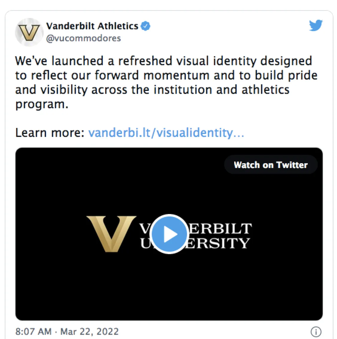
Recently, Vanderbilt University suddenly changed its logo, and it has stirred up a storm among students...
Despite the new logo's tacky gold color, the university even produced a fancy promotional video, saying it's a new logo for a new era, just in time for the upcoming 150th anniversary...
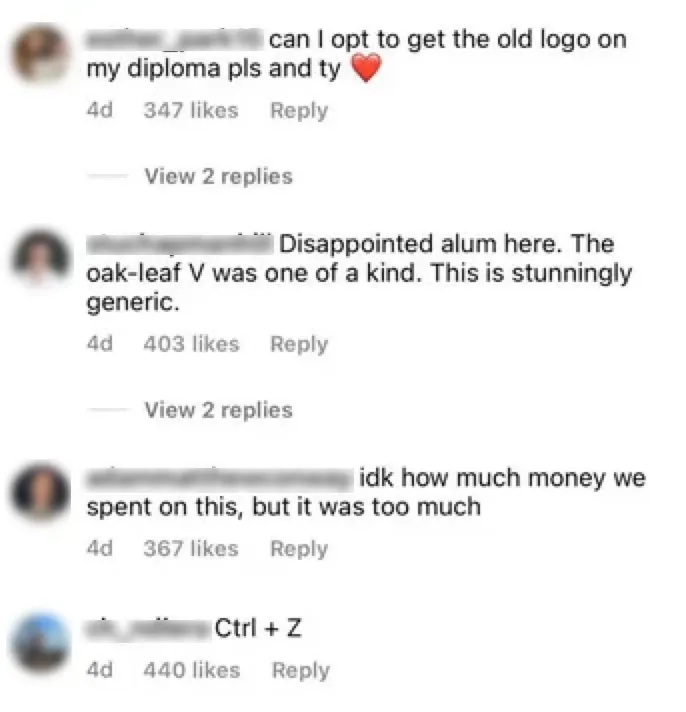
But, it seems no one is impressed. The comments section on the university's social media has been overrun:
Print the old logo on my diploma, thank you
As an alum, I'm really disappointed. The old oak leaf logo was so unique, and this new big V is just plain mediocre
I don't know how much this thing cost, but no thanks
Ctrl+Z (undo, please)
If I close my eyes, I could compliment it!
......
Vanderbilt University Old vs New Logo
Take a look at the old logo 👇

Very classic. The vintage V with oak leaves has an old-school academic feel that matches Vanderbilt's century-old prestigious image.
Founded in 1873 with a donation from railroad magnate Cornelius Vanderbilt, the university is located in Tennessee and ranks among the top 20 national universities in US News.
The university has produced many political, business, and academic elites, including two US vice presidents and seven Nobel laureates. Bain & Company founder Bill Bain and General Motors Chairman Mark Reuss are also alumni.
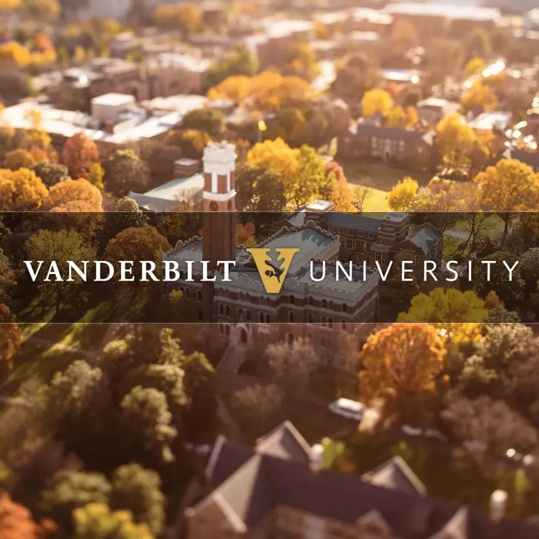
The new logo isn't necessarily ugly, but it exudes a club vibe, as if a salesperson is about to ask if you want a membership card.
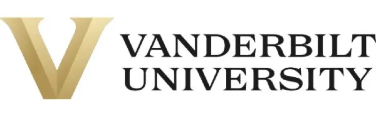
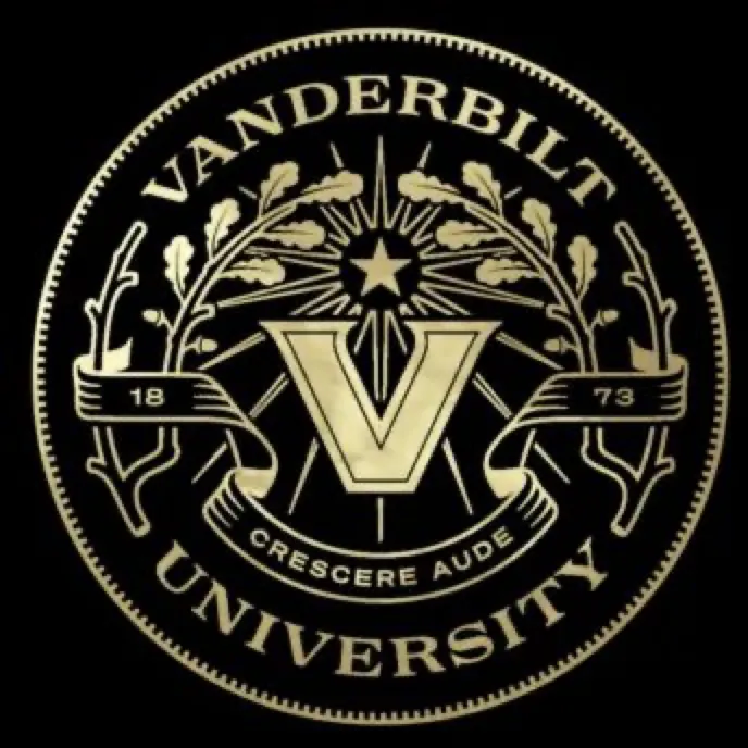
You can tell the university spent a fortune, replacing the entire visual identity. Besides the logo, they also changed the university seal:
Don't ask, it's the Hollywood version of The Great Gatsby:
To match this lavish design, they added a Latin motto: Crescere aude. The English translation, "Dare to grow," is equally baffling. The meaning doesn't matter; Latin is the fanciest.
The athletics logo didn't escape either 👇
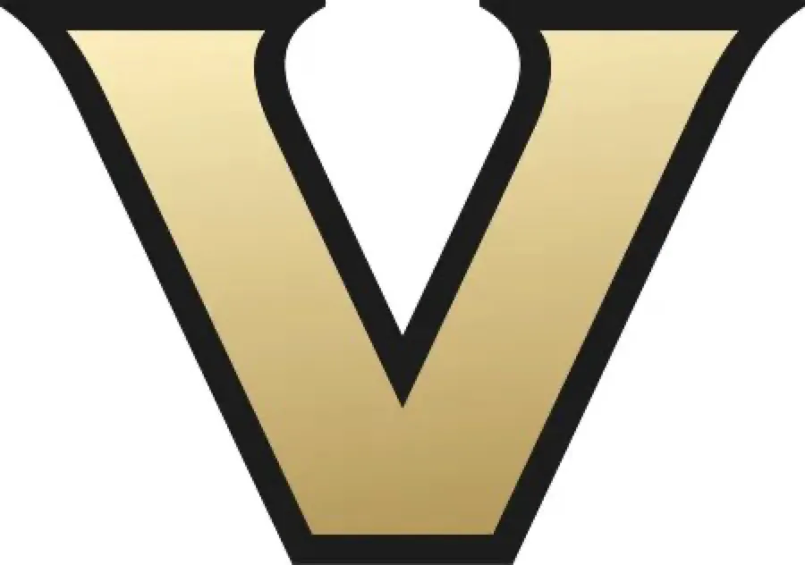
Look familiar? Netizens quickly spotted the resemblance: it's basically the Vegas Golden Knights logo.
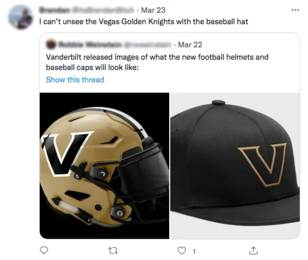
Indeed, it's hard to ignore this unexpected crossover 👇

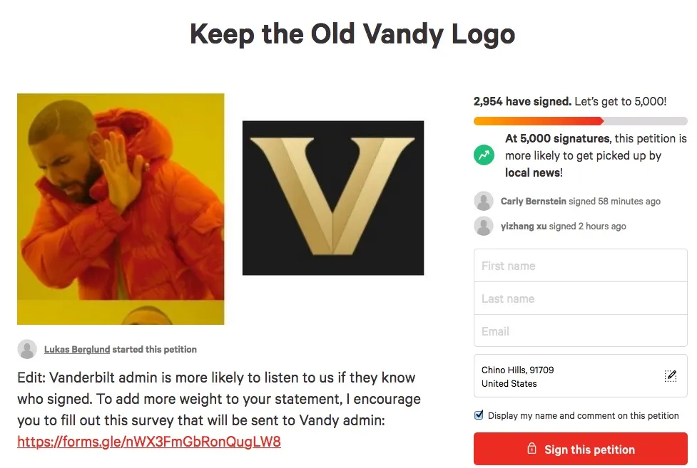
Students quickly launched an online petition demanding the university revert to the old logo. So far, nearly 3,000 people have signed:
However, the university is clearly happy with the new logo, having already produced merchandise and even launched a campaign encouraging comments for a free hat.
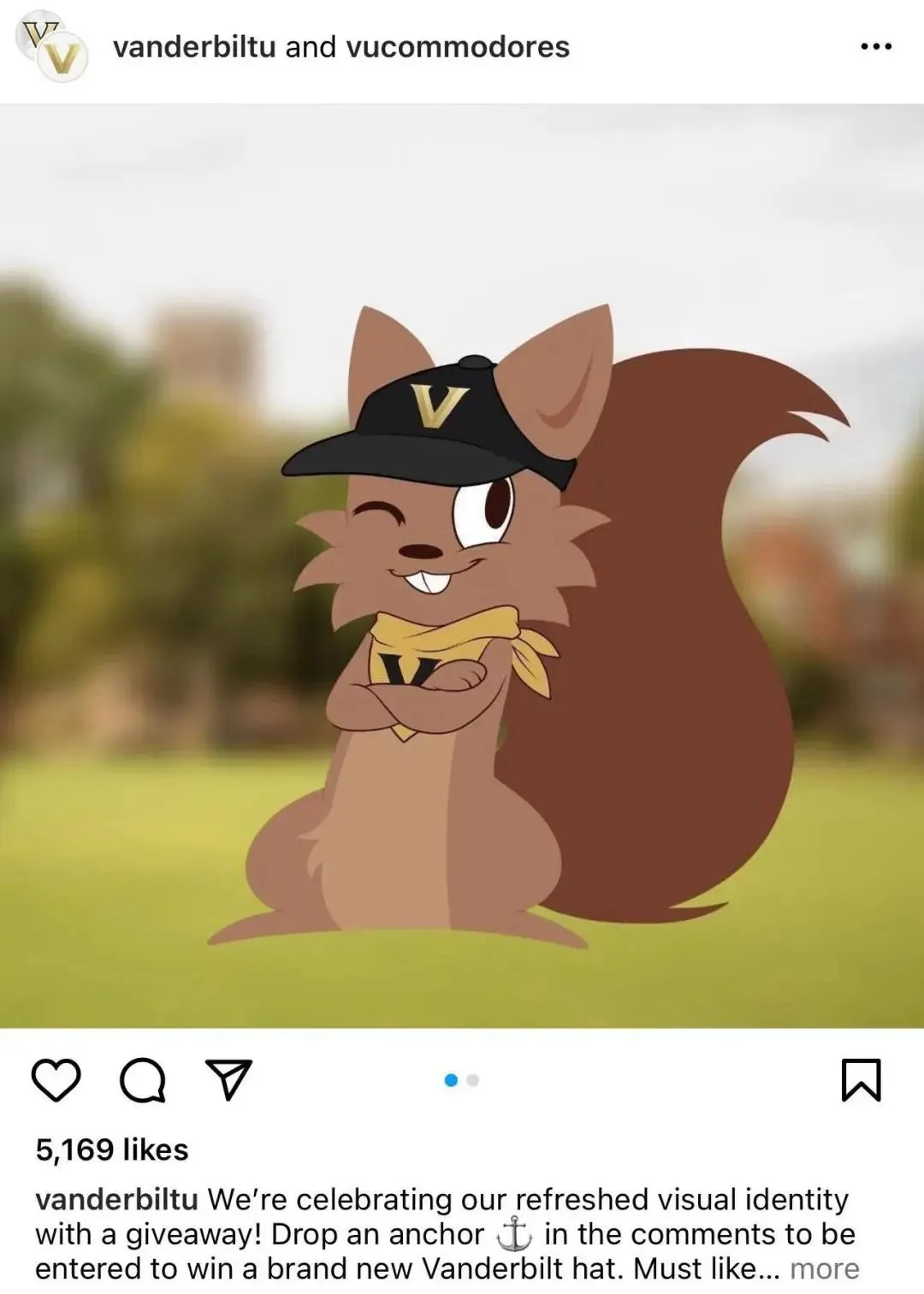
People are clearly even more exasperated:
Hahaha SOS this is just a letter V with zero design
I might as well design one for you
Is it April Fools' Day or what?
Yeah, you better give them away, because nobody's buying 😃

One student asked the million-dollar question: Did they even ask for student input on this ugly thing?
The university might feel wronged; reportedly, they conducted 500 surveys, 70 one-on-one interviews, and various workshops over the past two years for this new logo... spent a ton of money and effort, and finally gave birth to this ugly baby.
But Vanderbilt isn't the first US university to botch a logo redesign.
Spending big bucks on a logo change at the drop of a hat to wow everyone—it's a traditional skill of American universities.
Spending the Most for the Ugliest Logo
Western Michigan University
Western Michigan University also underwent a full rebranding last year. Let's see what they got after two years of research and a $672,000 price tag 👇
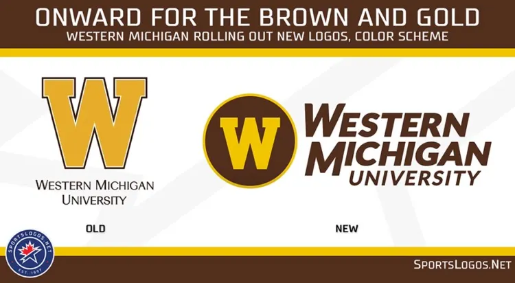
University officials thought it was great: "The new logo is elegant, simple, and consistent with our heritage."
Critics disagreed, and opponents quickly set up an account called "Ghost Bronco" to rally against the new logo.
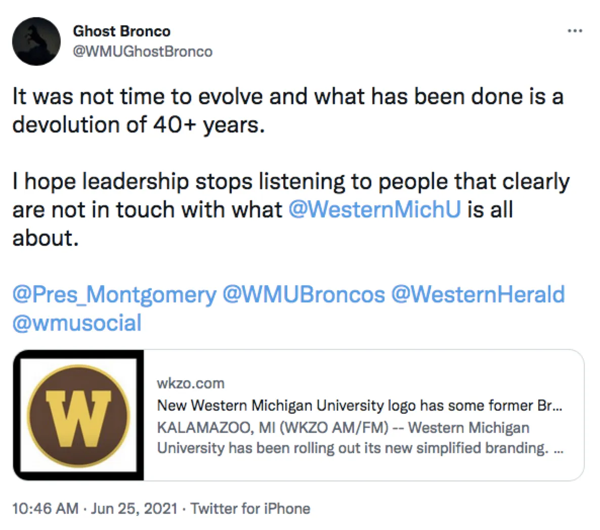
Besides thinking it's ugly, people also think it's a waste of money.
It's indeed wasteful. What could $672,000 do? Isn't it better spent on research and academics? Why change the logo just to invite criticism?
Pace University
Pace University also changed its logo last year, and faced similar backlash.
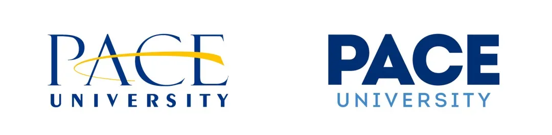
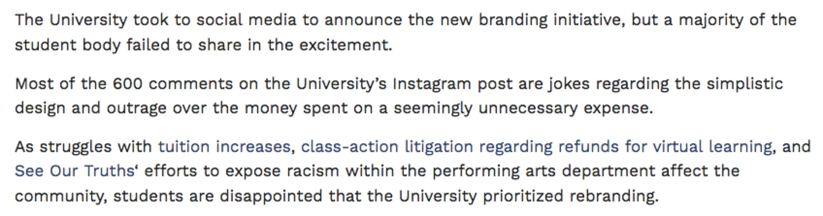
Although the university spent two years on research, many students weren't buying it. To be fair, the new logo isn't ugly, but it's a waste of money.
People feel that with soaring prices and rising tuition, money should be spent where it matters most. The university's focus on these flashy vanity projects seems out of touch.
Pennsylvania State University
Pennsylvania State University also changed its logo in the past.
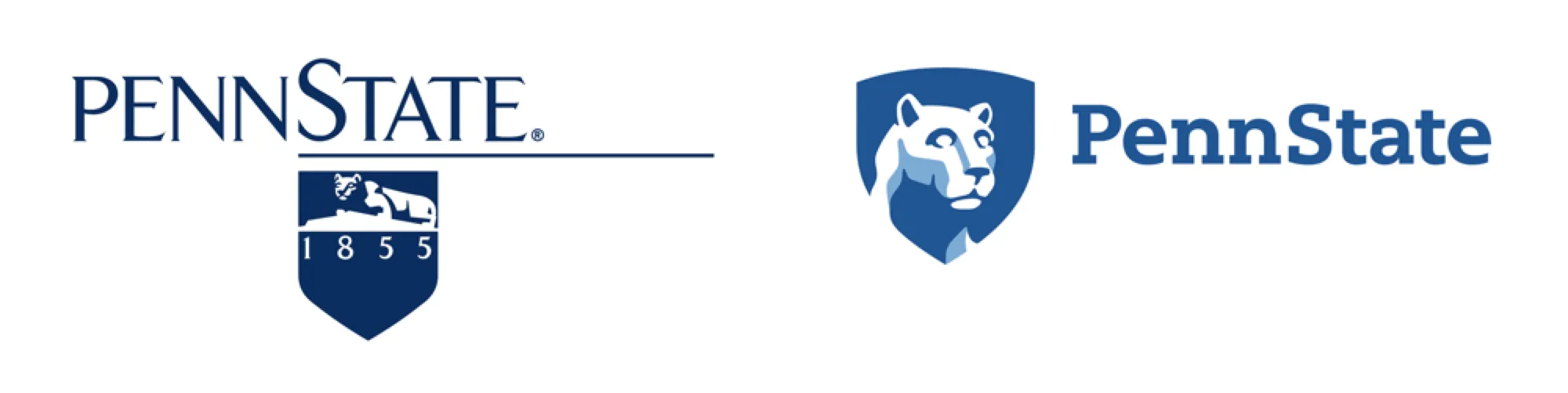
People freaked out when they saw it: the university spent $120,000 just to give the lion a big-head filter??

It might not have seemed so ugly at first, but after seeing the price tag, it became even uglier.
University of California System
Although the University of California's logo looks fine now, it sparked a firestorm when it first debuted.
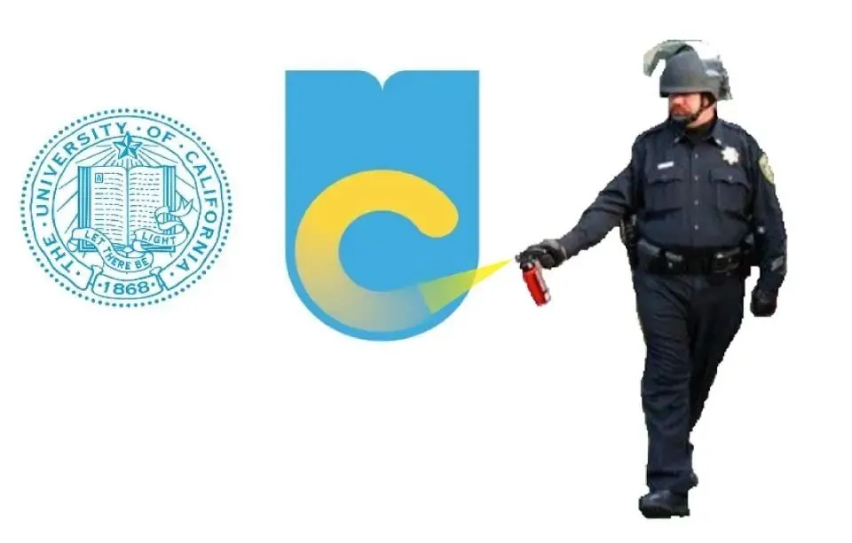
People said: What is this? A big U wrapped around a faded C; it's hideous.
Many students chanted "Put it back the way it was" and called for the university to restore the classic logo.
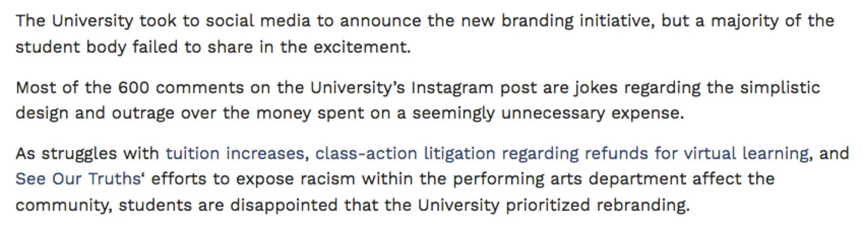
Now, 10 years later, the new logo is well accepted. Maybe it's just human nature—eventually, it grows on you.
Just like every Apple logo update—people complain at first, then one day they get used to it and find it's actually nice.
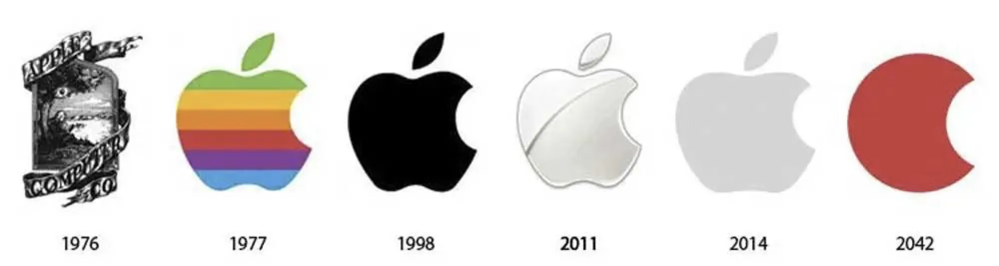
Nostalgia is a habit; many people have an attachment to classics. When a new logo first appears, it's normal to hear dissenting voices.
But the main reason for the backlash is the cost: hundreds of thousands of dollars for a logo change, when that money could be better spent, especially in these sensitive post-pandemic times.
Although each logo change may involve research, the effectiveness is questionable—otherwise, why is there still so much criticism after the reveal...
Aesthetics are subjective, but with prices soaring, universities should focus less on vanity projects and more on tangible benefits for students. We also hope schools can engage in genuine, effective communication with students and staff to avoid such unnecessary backlash in the future.