
Imperial College recently changed its logo, and it's been met with a storm of criticism.
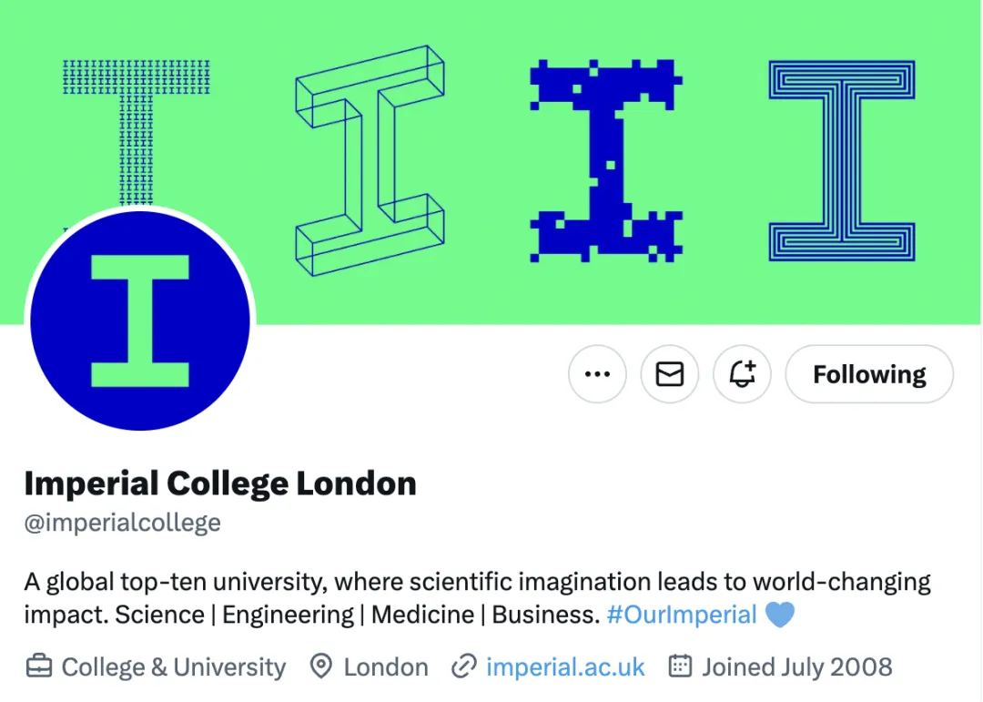
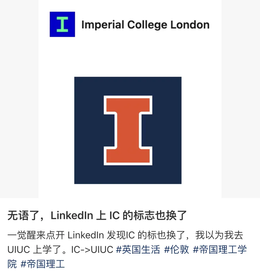
Netizens: Woke up and IC turned into UIUC.
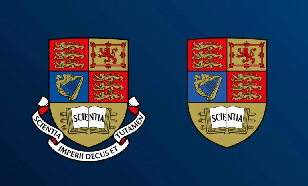
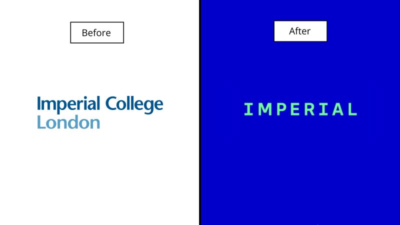
The old crest logo: ornate and vintage, full of heritage.
The latest logo: Are you sure this isn't UIUC?

Or maybe it's Indiana University Bloomington.


Students who got rejected by IC but received an offer from UIUC be like: It was you all along.

Supposedly a rebranding, current students want to drop out, and applicants are already put off.

.png)
Imperial College Changed Its Logo and Got Torn Apart
At the end of last month, Imperial College officially announced the logo change.

First look: Ugly. After staring: Blind. IC knows how to brainwash.

Netizens: Imperial, are you okay? A million pounds for this?

Netizens: This color scheme, are you sure it's not ripped off the London Underground card?
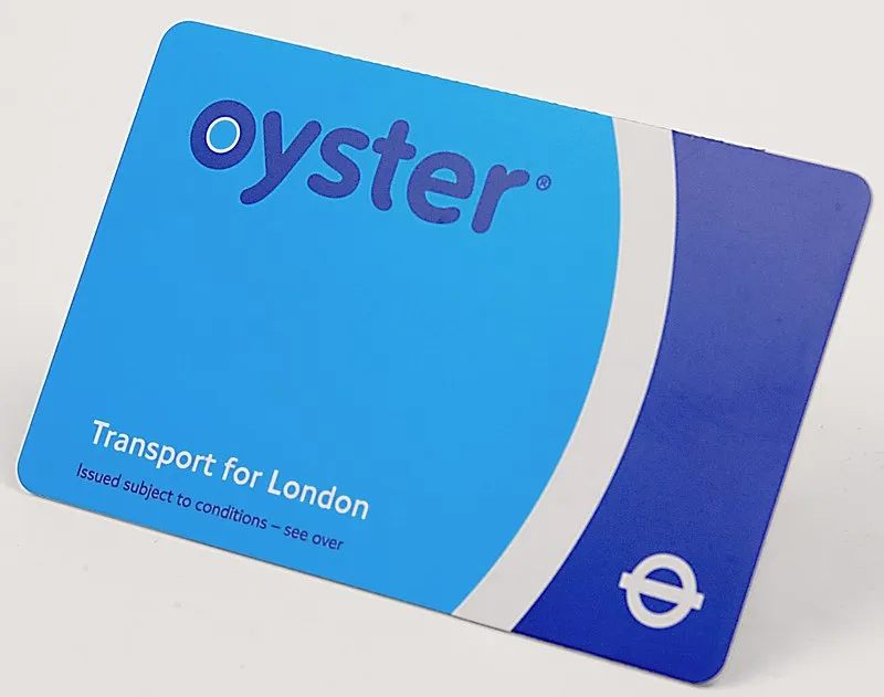
IC proudly presents the engineering aesthetic, printing the school name with Python.

Engineering students say: Don't blame this on us.

Open Blackboard and get hit with the capitalist-designed ugly logo, feel the impact of Klein blue.

Ultra-minimalism, with retro computer font aesthetics from the 90s, this million-pound new logo is here.


From the left, it looks like a diploma mill; from the right, an auto parts dealer. Truly South Kensington Vocational School.

Totally lacking the gravitas of a prestigious university, reeking of fast-food industrial style. Not only falling further behind Oxbridge, even neighboring UCL comes out on top effortlessly.

A million pounds for this? Sure it's not money laundering?

Ugly but expensive, makes your eyes go dark. A devastating blow from all angles. International students' lives matter too, but IC doesn't care.

IC really knows how to drive international students insane; a shattered dream for applicants.

Alumni say: Already reported.
More than 5,000 people have already signed an online petition calling for the school to bring back the old logo.

Ugly but Pricey: A Chronicle of IC Going Off the Rails
There were hints last year that IC would overhaul its logo👇
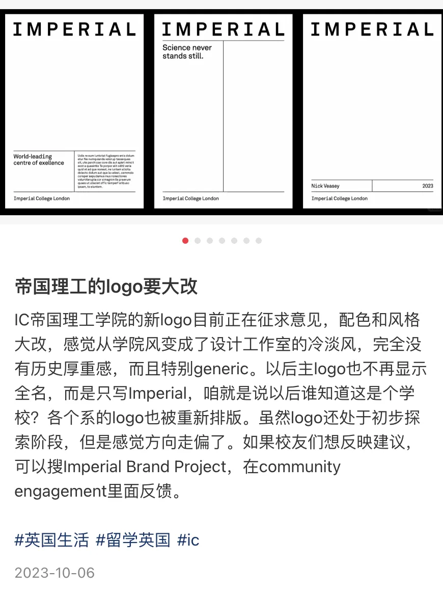
No one expected the logo change to be just one part of IC's rebranding. The school's brand overhaul includes:
-
Research and analysis
-
Brand positioning
-
Visual design (logo, font, color scheme)
-
Brand management
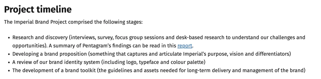
This logo was created by the top design firm Pentagram, with a consulting team and extensive research, churning out a 40-page PPT.

Netizens: Were the school's 350 surveys conducted with blind people?

IC has 30,000 students and staff, yet most were left in the dark, and the petition signed by 5,000 people is being ignored—ridiculous.

If the previous logo change was because the motto on the crest had colonial overtones, then the latest logo retaining only 'Imperial' would be even more controversial, wouldn't it?
The last time we saw such absurd political correctness was Google Gemini generating the Founding Fathers😅

Netizens: Feels like after this logo change, they might drop out of QS top 10.

IC can only huddle with Sheffield for comfort now, since Sheffield not only got an ugly new logo but also fell out of QS top 100😅

Elite School Rebrands: The Capitalists' Ugly Logos
In recent years, elite universities in the UK and US have been rebranding, ditching heraldic shields, pursuing minimalism, all chasing that Apple aesthetic.
University of Sheffield
Sheffield changed its logo last year to a chorus of complaints.
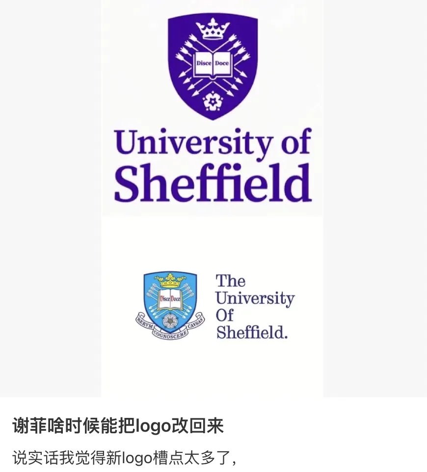
The new logo is gradually morphing into Manchester's style, sparking a student petition.
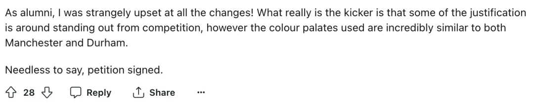
Congratulations to Sheffield for officially joining the purple F4, alongside Manchester, Durham, and Loughborough, all taking cues from NYU😅
University of Southampton
Thanks to the competition, even Southampton's logo now looks rather pleasant.

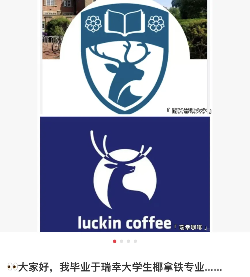
Besides showcasing the school's enduring love for animals and resembling Luckin Coffee, there's basically no major flaw.
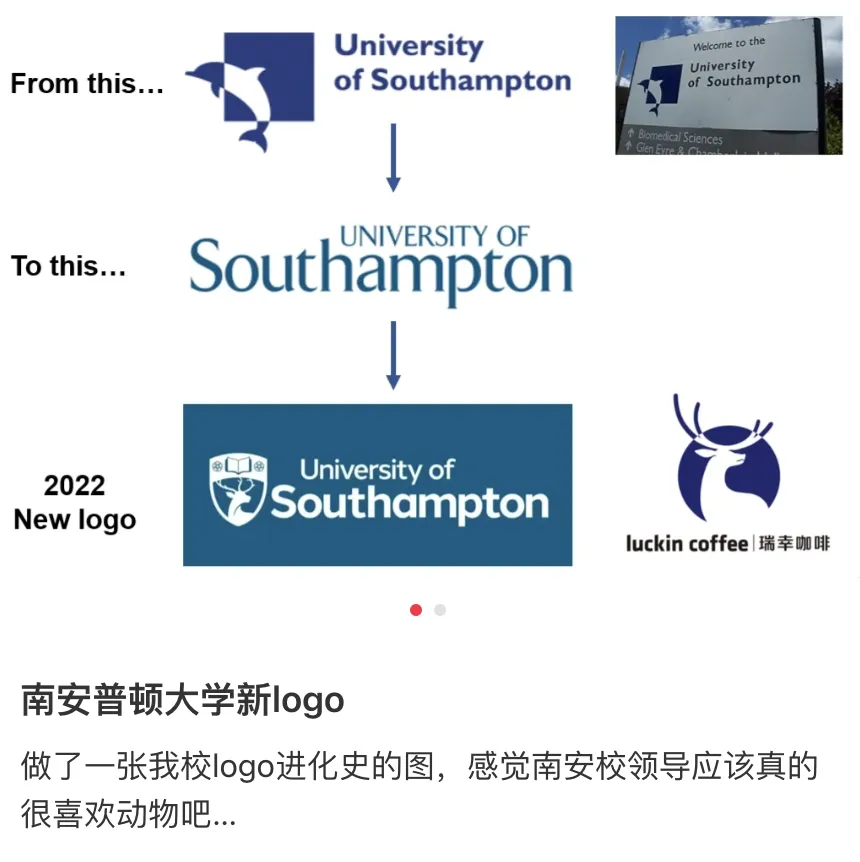
Southampton students are memeing online: "Hello, I'm from Luckin University, majoring in Raw Coconut Latte."
Harvard GSD
Last year, Harvard Graduate School of Design also unveiled a new logo, aiming to reflect critical design thinking.
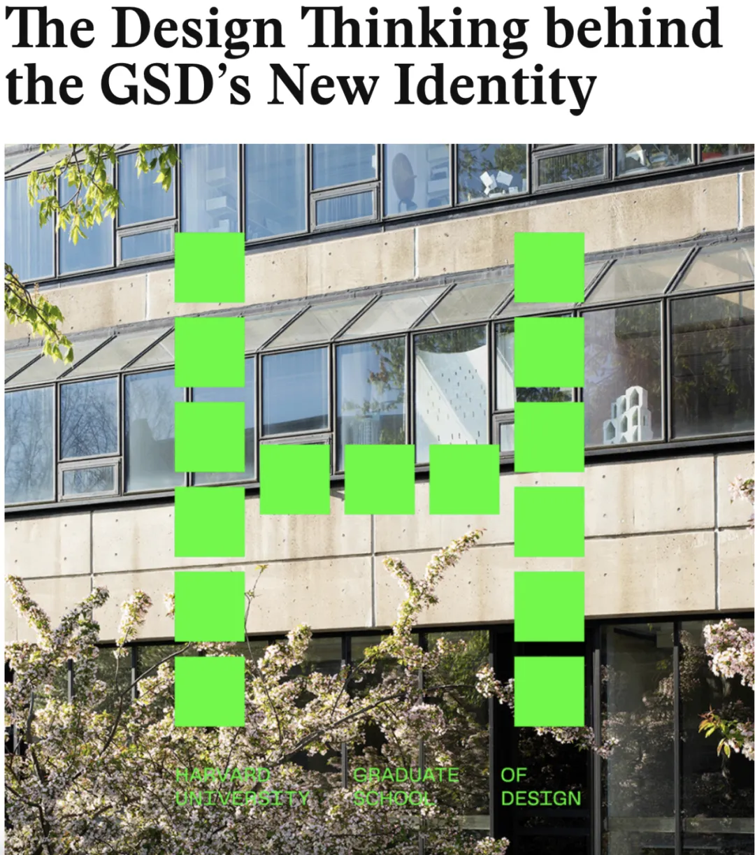
It got slammed when first released, but now looking at IC's, maybe it's not so bad?

Vanderbilt University
Vanderbilt's logo change earlier was also heavily criticized.
A gaudy gold logo, crafted at great expense. Not exactly ugly, but exuding a vibe of a high-end club, like a salesperson might ask if you want a membership any second😅
University of South Carolina
University of South Carolina's new logo looks so bad it might be mistaken for a US diploma mill.
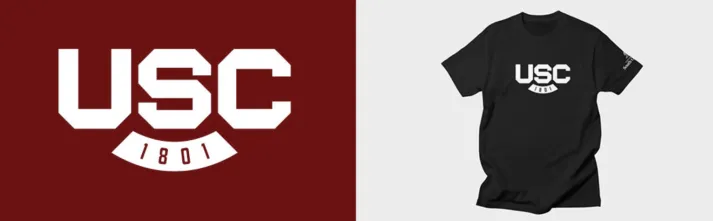
Netizens: Which marketing genius came up with this, please refund the tuition, thanks.

Western Michigan University
Western Michigan University's logo change took two years of research and cost $672,000, with the results below👇
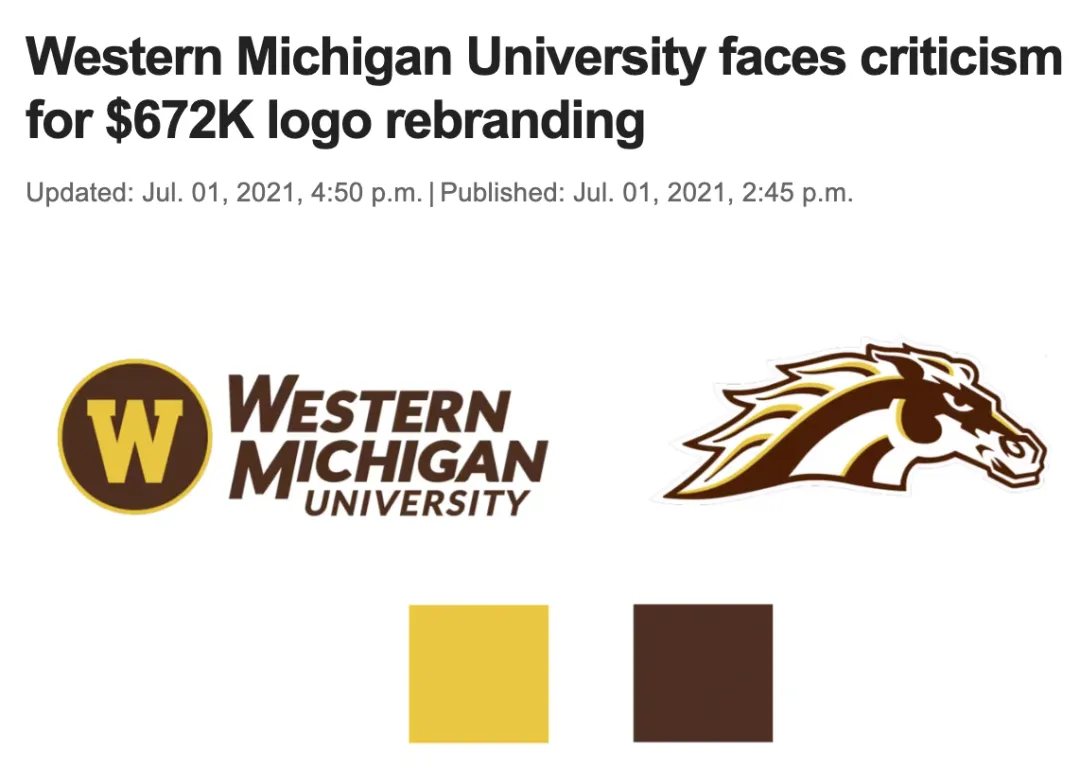
Students created an account called Ghost Bronco specifically to protest the new logo😅
Penn State University
Penn State's logo change also drew fire.

Netizens: Spent $120,000 just to give the lion a big-head filter❓

There are universities that redesigned their logos nicely, but very, very few.
For example, UMass's new logo feels fresh while retaining its character.
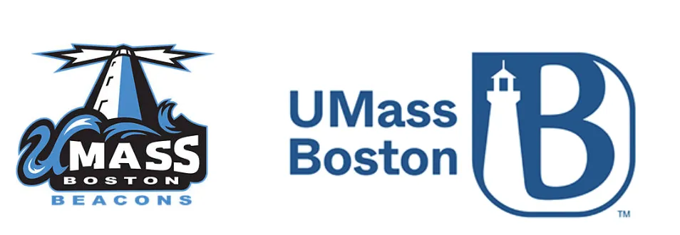
Or universities could learn from Manchester, using two logos—one for everyday use, another for ceremonies like graduation. This way, they integrate modern elements while preserving heritage.
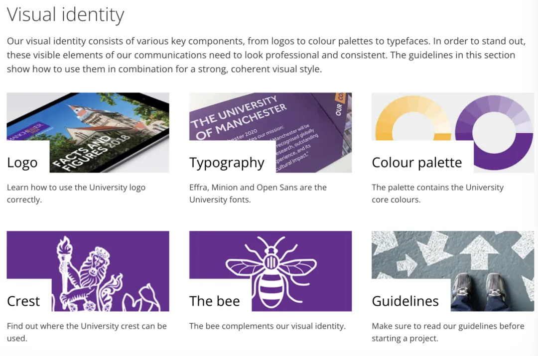
Opposition to a new logo is normal.
But the reason schools get bashed is mainly the exorbitant cost—hundreds of thousands or millions of dollars/pounds—and everyone is forced to use these capitalist-designed ugly logos.
Tuition rises every year; hopefully, schools can put money to real use, like constructing buildings, expanding enrollment, improving faculty, etc.
Even if they must change it, communication is key. Surprise announcements like this should really stop.